


Life has returned to normal in the US and UK – judged by the crowds attending Wimbledon, Wembley and Whistling Straits. With only the occasional mask to remind us of a crisis passed. The normal is once again guiding our expectations and economic actions, and is determining the value of the assets we own.
Normal for now, that is, and until the next crisis again moves the markets. Its timing, causes and consequences will remain one of the great known-unknowns, or perhaps it will even be an unknown- unknown (in the words of the recently passed Donald Rumsfeld). However, the successes of recent crisis management may help put us in a better position to cope.
We can define an economic crisis as a serious disruption of economic activity, leading to the severe loss of income and the benefits gained from producing and consuming goods and services. A crisis is therefore destructive of the value of the assets we own, which depend on such incomes.
A crisis is worse than your average recession, when GDP declines by a percent or two below trend for a year or so. The failures of the banks and insurance companies in 2008-2009 resulted in the Global Financial Crisis (GFC), which threatened to implode the real economy with them. In 2020, economies were shut down summarily to escape the pandemic, resulting in the loss of as much as a quarter of potential GDP, a large sacrifice of potential incomes and output.
Overcoming these two crises relied essentially on governments and their central banks. In the case of the GFC, it required central banks to shore up the global financial system buying assets from banks and financial institutions on a vast scale, in exchange for central bank money.
The responses to the crisis of 2020, at least in the developed world, were more immediate, less equivocal and on a larger scale than after 2008. They added much direct income relief to the monetary injections. They have surely succeeded not only in reducing the pain of lockdowns, but also in ensuring that demand for goods and services would recover with the supply of goods, that a return normality makes possible.
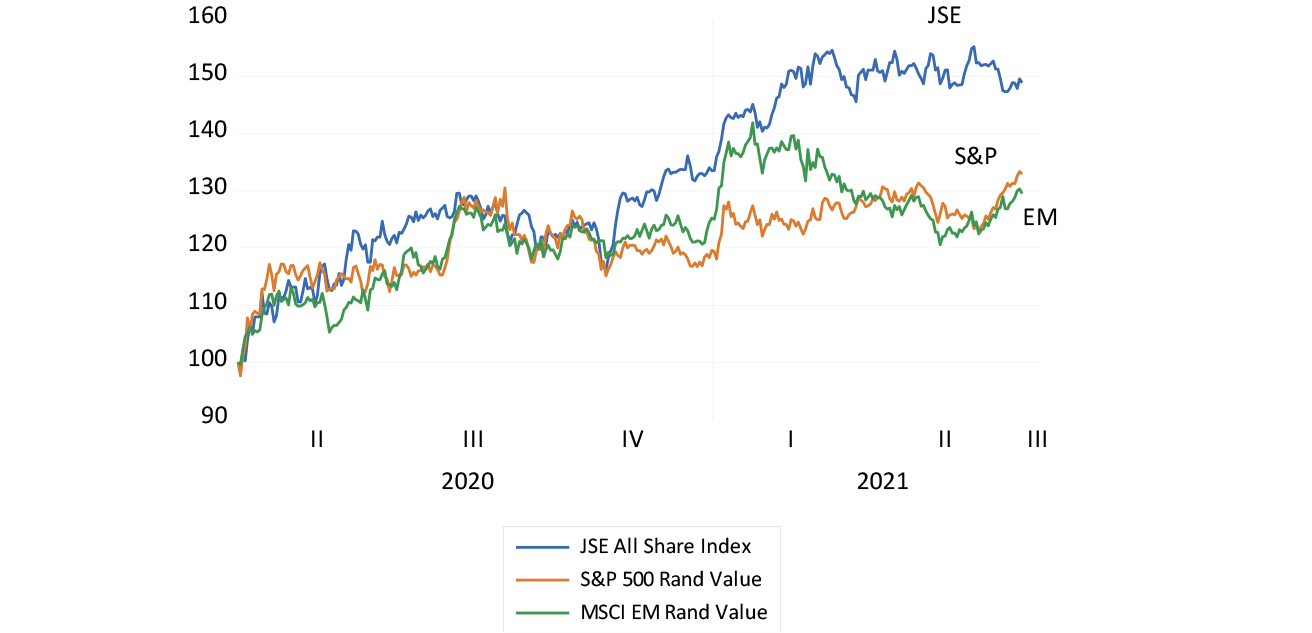
Judged by the signals provided by the markets in shares, bonds and commodities, the economic crisis is now well behind the developed world. US, emerging market (EM) and therefore South African companies are now worth significantly more than they were when the lockdowns became a reality in March 2020, when the US Index lost 13%, the EM Index 17% and the JSE gave up 27% of its US dollar value. The JSE had lost 14% of its value the month before.
The JSE from these lows has been a distinct outperformer, in dollars and in rands. The JSE has gained 50% compared to a 30% gain for the S&P and EM indices, when converted to rands. In dollars, the gains since the trough are even more impressive. The JSE is up 86% compared to the 66% and 61% gains for the S&P and EM since the crisis lows.
Regularities of a crisis
This indicates one of the crisis regularities for SA. South African assets and incomes are highly exposed to changes in global risk, losing more during a crisis and then gaining more than the average EM equity or bond when the crisis is over. It is also worth noting that the JSE has not moved much since March this year – another sign of normality. If only we had the gumption not to waste a good crisis.
The JSE compared to the S&P 500 and the MSCI EM in rands (January 2020=100)
Source: Bloomberg and Investec Wealth & Investment.
21/07/2021
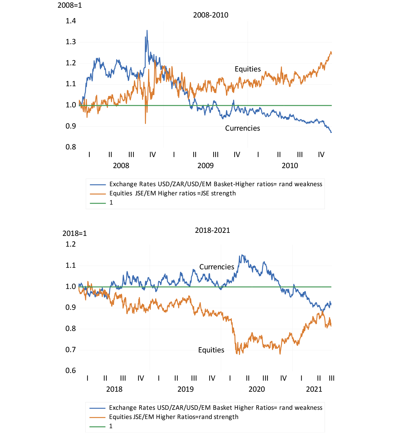
This illustrates another regularity when an economic crisis is not of South African making. The rand is what we call a high beta EM currency – it does worse than its EM peers when risks are elevated and better when global risks decline, as has been the case with the JSE. During the height of the present crisis the rand/US dollar exchange rate and the JSE were 30% weaker compared with EM peers. They are now back to the normal long-term relationship of an average of one to one.
The rand and the JSE – Ratios to EM currencies and equity indices (2008 to 2010 and 2018 to July 2021)
Source: Bloomberg and Investec Wealth & Investment.
21/07/2021
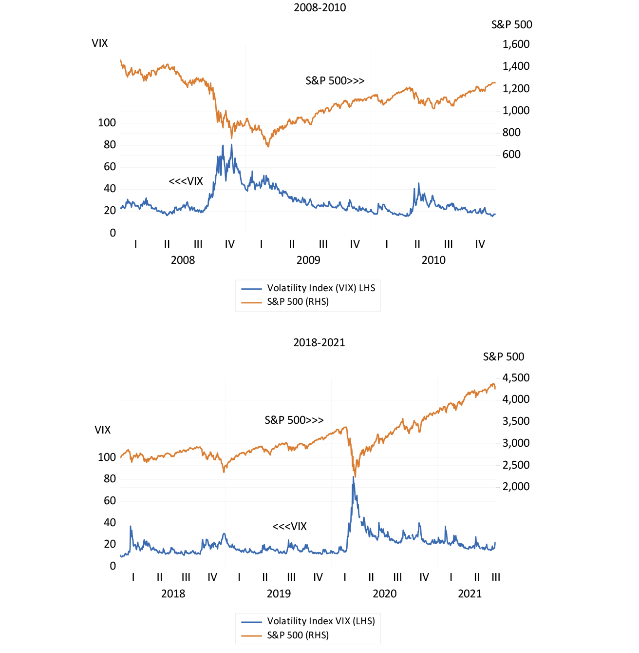
Global market risks are easily identified by the volatility of the S&P 500 index, as represented by the well-known volatility index, the VIX. When these daily moves become more pronounced and share prices bounce around abnormally, the cost of insuring against market moves becomes ever more elevated – shares lose value when the future appears much less certain. Higher expected returns, and hence lower share prices, compensate for increased risks. In short, the VIX goes up and share prices go down in a crisis.
Volatility and the S&P 500 (2007 to 2010 and 2018 to July 2021)
Source: Bloomberg and Investec Wealth & Investment.
21/07/2021
The daily average for the VIX in the two years before the pandemic was 19 – it was over 80 at the height of both crises. It has recently moved back to 19.
The S&P 500 index is now in record territory in nominal and real terms. In inflation-adjusted terms, the S&P 500 is up about 7.4% a year since the low point of the financial crisis. Real earnings over the same period have grown at an annual average rate of 5.9% since 2009, an above average performance.
Looking for cover
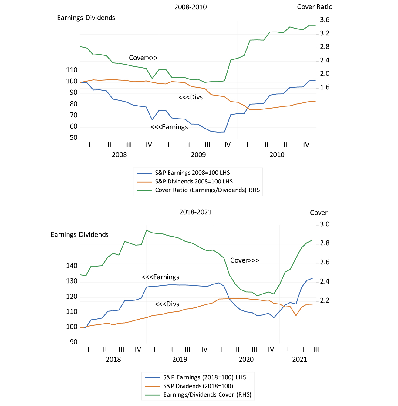
Another regular feature of a crisis is the behaviour of the cover ratio – the normally very close relationship between earnings and dividends. The more cash retained (the less paid out) the more value that is added for shareholders.
The S&P 500 and the cover ratio (earnings/dividends) (2008 to 2010 and 2018 to July 2021)
Source: Bloomberg and Investec Wealth & Investment.
21/07/2021
We make the presumption that the extra cash retained is invested well and earns above its opportunity cost. S&P earnings are again rising much more rapidly than dividends (which held up better during the crises). Indeed, analysts, absent the usual guidance from the managers of the companies they report on, are still struggling to catch up with the buoyant earnings recovery now under way. Earnings surprises are the order of the day.
The cover ratio for the JSE follows a similar pattern in times of crisis and has a similarly negative impact on share valuations. The more companies pay out dividends relative to earnings, the less these companies are generally worth. The recent recovery in cover ratios to something like their longer-term averages is another sign of normality, as well as a support for share prices. Ideally, the JSE cover ratio declines in line with the increase in opportunities to invest in ways that would add value.
SA shows its metal
A further regular feature of the economic crises of recent times and the recovery from them has been the behaviour of commodity and metal prices that make up the bulk of SA’s exports. They fall during a crisis and they recover strongly as the crisis passes by as they are doing now. Metal and mineral prices lead the South African business cycle in a very regular way. Commodity prices lead, the rand follows, inflation is then contained and interest rates, at worst, do not rise. And the money and credit cycles accommodate the rising incomes that emanate initially from the mining sector.
We are far from the super cycle we benefitted from in the lead up to the GFC of 2008. But we can hope that above normal demand for metals will continue to impress itself on below normal supply responses, translating into higher prices.
Industrial commodity prices (2008 to 2010 and 2018 to July 2021) (January 2008=100)
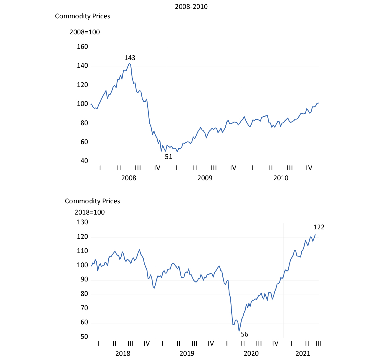
Source: Goldman Sachs Industrial Commodity Price Index, Bloomberg and Investec Wealth & Investment.
21/07/2021
While long-term interest rates in SA have recovered from their crisis-driven extremes, they remain discouragingly elevated. Discouraging because they imply high hurdles for capital expenditure budgets to leap over and hence low cover ratios and less cash retained for capex. The gap between short and long-term interest rates, the slope of the yield curve, has moreover remained at crisis levels.
The yield curve implies that short-term interest rates will double within three years. This is a prospect that seems completely out of line with the outlook for the SA economy. We can only hope that the market has got this badly wrong.
The crisis-driven SA economy should not be forced to adjust to higher interest rates. It would be inconsistent with the economic and financial stability that the Reserve Bank is constitutionally charged to secure. It takes much more than low inflation to overcome an economic crisis, as South Africa may still come to recognise.
SA long and short-term interest (2008 to 2010 and 2018 to July 2021)
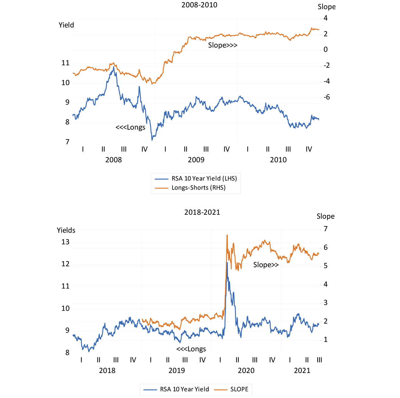
Source: Bloomberg and Investec Wealth & Investment.
21/07/2021
About the author

Prof. Brian Kantor
Economist
Brian Kantor is a member of Investec's Global Investment Strategy Group. He was Head of Strategy at Investec Securities SA 2001-2008 and until recently, Head of Investment Strategy at Investec Wealth & Investment South Africa. Brian is Professor Emeritus of Economics at the University of Cape Town. He holds a B.Com and a B.A. (Hons), both from UCT.
Get Focus insights straight to your inbox
Investec products you may be interested in


Browse further in